William Jewell College is often praised for the beauty of its campus buildings. However, not much has been said (at least not in an official capacity) about the campus’ particular artistic features. Sure, the facades of the buildings are impressive, but what of the paintings, vases and other artistic interior decor within those buildings? This article will attempt to undertake a review of some of the iconic art on campus.
Abstract Painting on the Quad Level Floor of Pryor Learning Commons
To preface my discussion with something of a disclaimer: I’m not exactly a fanatic of abstract art. When I do enjoy abstract art, it’s because the piece is accompanied by some additional information, like an essay, that transforms my experience of the art. No longer is that art piece mere irreverent or chaotic brushstrokes, but brushstrokes and chaos harnessed for some specific purpose (however vague).
A good example of this is the Danish art and literature magazine Helhesten, published during the German occupation of Denmark in World War II. Its nonsensical, whimsical and child-like pieces — often accompanied by the artists’ political essays — were a form of protest against Hitler’s concept of ‘Aryan’ art.
In contrast, the abstract painting in the quad level of the PLC is highly decontextualized abstract art. There appears to be no discernible artist signature, though this is difficult to verify because it is placed so high up. Without context or a means of obtaining context by researching the artist, the piece is just random – and random in a highly illogical spot. Why place it so high up? Why choose such a decontextualized, abstract piece?
Both the placement of the piece and inscrutability of its content suggests that the choice of the painting was arbitrary – no more deliberated than the placement of art at a cheap hotel. The painting doesn’t even really complement the red vases which frame it.
For the record, the vases themselves are a perplexing decoration choice. Lipstick red vases atop an extremely high chimney? They look heavy. Who put them up there, and when?
Abstract Painting in the Second Floor of Jewell Hall
This one is a little better. For one thing, you can actually examine it without craning your neck. Secondly, the faux orange flowers on the table complement the orange tones of the painting (as an aside, I love the faux cattails. I love to see strange hot dog plants). The strategically placed light illuminates a portion of the painting dominated by a half-circle, which creates an interesting ‘halo’ effect.
However, as with the abstract painting on the PLC, there really is no way to obtain more information on the painting – there’s no discernible artist signature. I wonder whether the paintings would attract more of an audience if some kind of signage was created.
In either case, the painting is a good size and has some amount of visual interest. I’m not entirely convinced I like its strangely ‘dry’ texture, presumably created by applying a small amount of paint on a dry canvas and spreading it thinly. The resulting effect on the color is something that I would call desabrido in Spanish: blanched and without much character. The painting evokes drywall, or perhaps plaster.
Large Art Prints in the Union


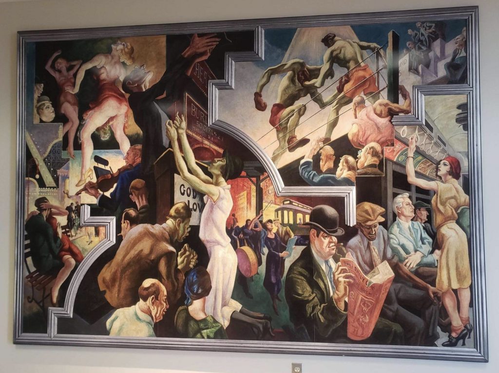
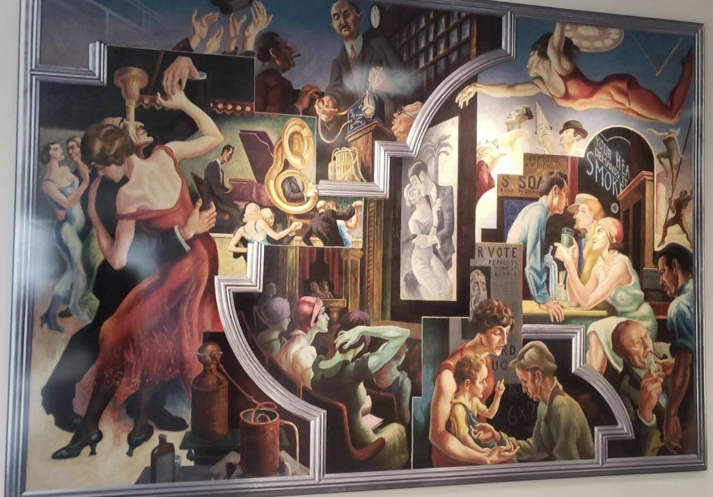
I like these art pieces because they have a lot of life to them – it’s fun to try and track exactly what each of the depicted subjects is doing, and then compare their activity to the other depicted activities. The usage of a faux frame to divide the spheres of activities within the paintings creates some fun confusion about the interrelationships which complicates the activity of frivolous discernment.
However, I am a little disappointed that closer inspection reveals that the pieces are not originals, but in fact a kind of glossy print of the original artwork. It would be cool to feature some original artworks, and not the prints, given that I think an analysis of art benefits significantly from an examination of the textural properties of the pieces – something which is difficult to analyze in a print of the original work.
Venus Fly Trap Painting in Brown Hall

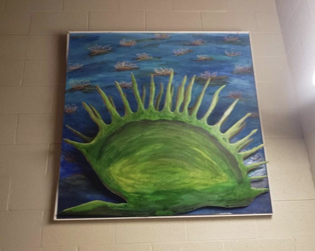
Awesome! I love mixed media paintings that recall a pop-up book. This is probably my favorite painting on campus. I wonder if the inside of the Venus Fly Trap is painted as well? Hard to tell, given that the painting is so high up. I think it should be displayed in a more public spot on campus – it’s lonely in that Brown Hall side-staircase.
Photos by Agatha Echenqiue.
