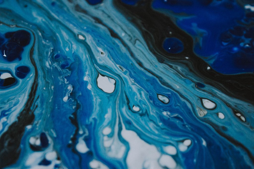
Since 1999, Pantone has issued a Color of the Year meant to encapsulate fashion trends, interior design, art and culture. The color is supposed to symbolize how the world is feeling at the end of one year and what we hope for in the coming year. This year, Pantone made a simplistic yet bold choice for the 2020 Color of the Year – Classic Blue.
“Instilling calm, confidence, and connection, this enduring blue hue highlights our desire for a dependable and stable foundation on which to build as we cross the threshold into a new era,” the company said at the color unveiling in December.
As we enter this new decade, the world seems anything but calm and confident. 2020 has already seen devastating fires, political chaos and tragic deaths of beloved icons. Classic Blue – something serene and familiar – might be just what we all need.
These are the sort of things the Pantone Color Institute considers when choosing their color of the year. Their website says that art, fashion, lifestyles, social media, food, travel destinations and color psychology all factor into their final decision.
The blue shade also brings to mind the history of the Color of the Year. In 1999, when Pantone launched the first color of the year, they chose Cerulean, a lighter, more energetic shade of the same color family. Pantone said the color was chosen to reflect anxiety about the new millennium, as well as the excitement for what’s to come.
Cerulean no doubt had a huge cultural impact that year, covering the runway, taking center stage in new art and home design and inspiring the classic speech by Miranda Priestly in “The Devil Wears Prada.” Expect to see Classic Blue take on a bigger role in fashion, film and photography in the coming months.
This is why the artists and designers behind the Color of the Year place so much significance on what the color means to people. While we might look at classic blue and see a tried and trusted color, the artist and designers see an evening sky, a sense of culture and comfort and a feeling of reassurance that everything is going to be okay.
But however comfortable and familiar Classic Blue might be, it’s also reflective of progressive movements. The shade is genderless and timeless, meant to be loved and worn by everyone. In America, blue is the color of the Democratic Party, and may be seen as a not-so-subtle nod to the 2020 Presidential Election.
Classic Blue is also indicative of nature, as the color brings to mind the sky at dusk and the sea in the mornings. Since the color can be obtained from natural plants, it was one of the earliest dyes and fits in with calls for sustainable fashion.
However, Classic Blue doesn’t mean the same for everyone. What some see as evocative of dependability and tranquility, others relate to mourning or depression. They see a dangerous call for loyalty, order and the “good ol’ days.” For some it even calls to mind raging masculinity and patriarchal power.
Facebook, Amazon and Microsoft’s use of the shade has also redefined the color, and many now associate it with technology dependence, data mining and the darker side of social media.
Whatever the shade means to you, industries throughout the world turn to the Color of the Year for inspiration and direction. In a world where nothing seems secure, one thing is certain – Classic Blue is making a comeback.